When was last time you bought something online? Chances are you’ve been to one of the 800k+ unique stores that uses Shopify’s checkout. Over the past few years I’ve had the pleasure of working with two amazing teams at Shopify to make buying online as frictionless as possible, transforming an otherwise tedious process (think long forms and confusing payment flows) into almost an invisible touch point. One of these projects is the dynamic checkout button. (Sorry - everything else is under an NDA!)
Like most things in life, there's no “one-size-fits-all," and this applies to the checkout flow. Early on we noticed that most purchases that on Shopify stores are single-item checkouts, yet the current flow requires everyone to add to cart, navigate to cart, and then finally select checkout from a list of options.
Needless to say, this was a slower path for buyers who are ready to checkout a single product, especially in use cases such as flash sales and mobile shopping where convenience and speed is essential. Our goal was to remove this bottleneck by bridging the gap between ready buyers and the appropriate checkout, and decreasing the time to order completion.
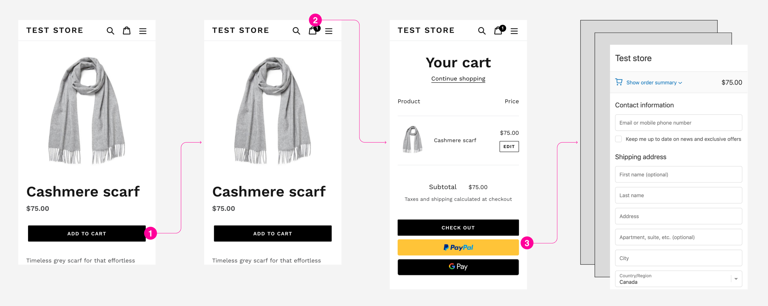
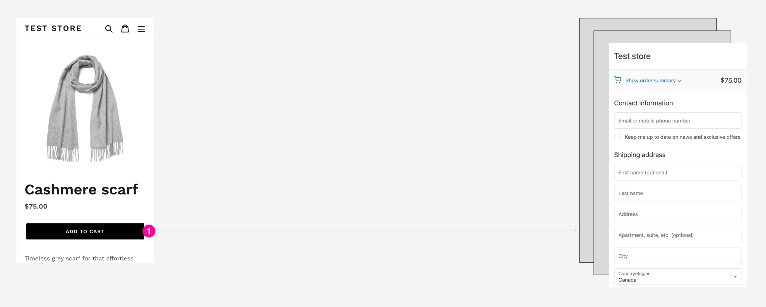
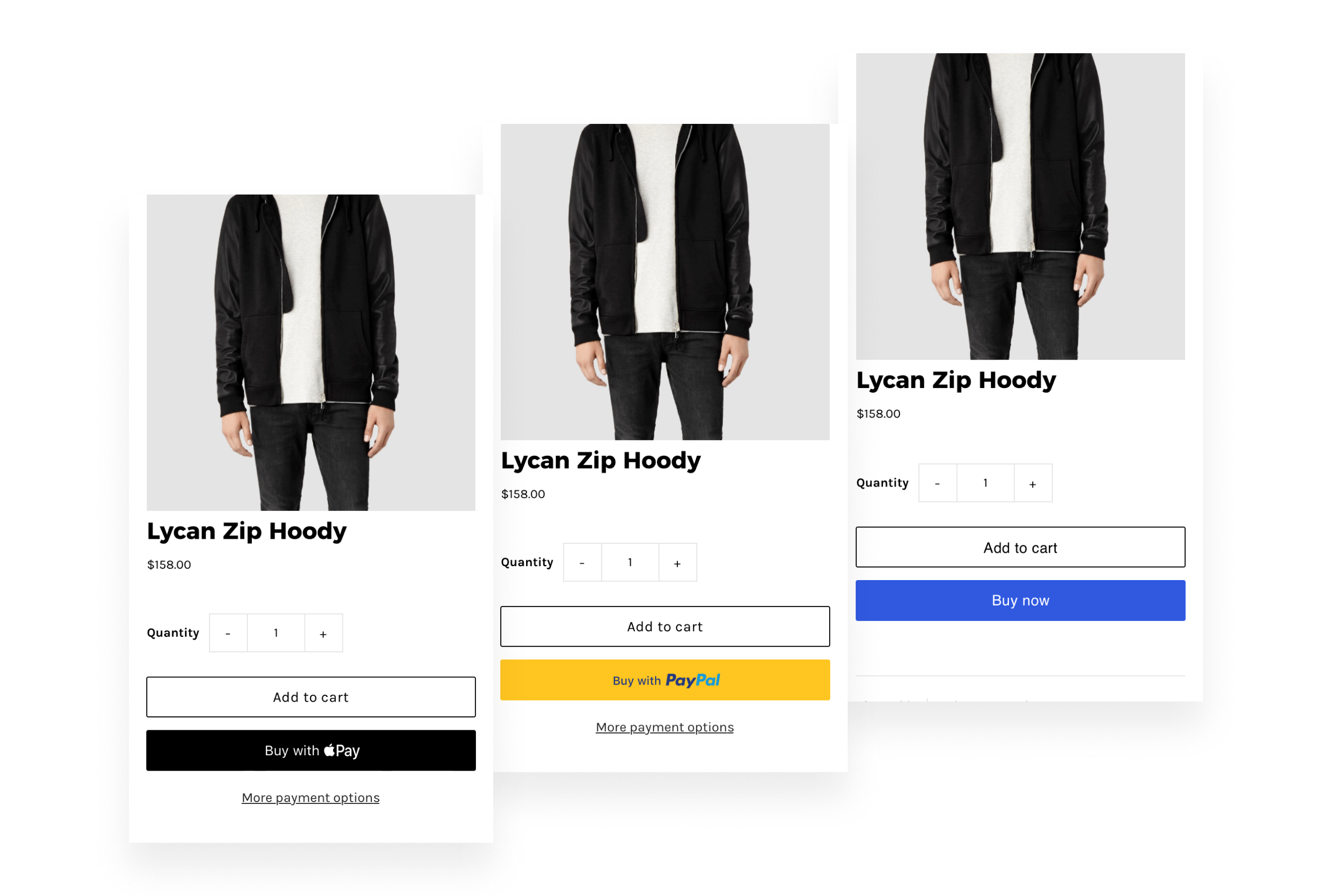
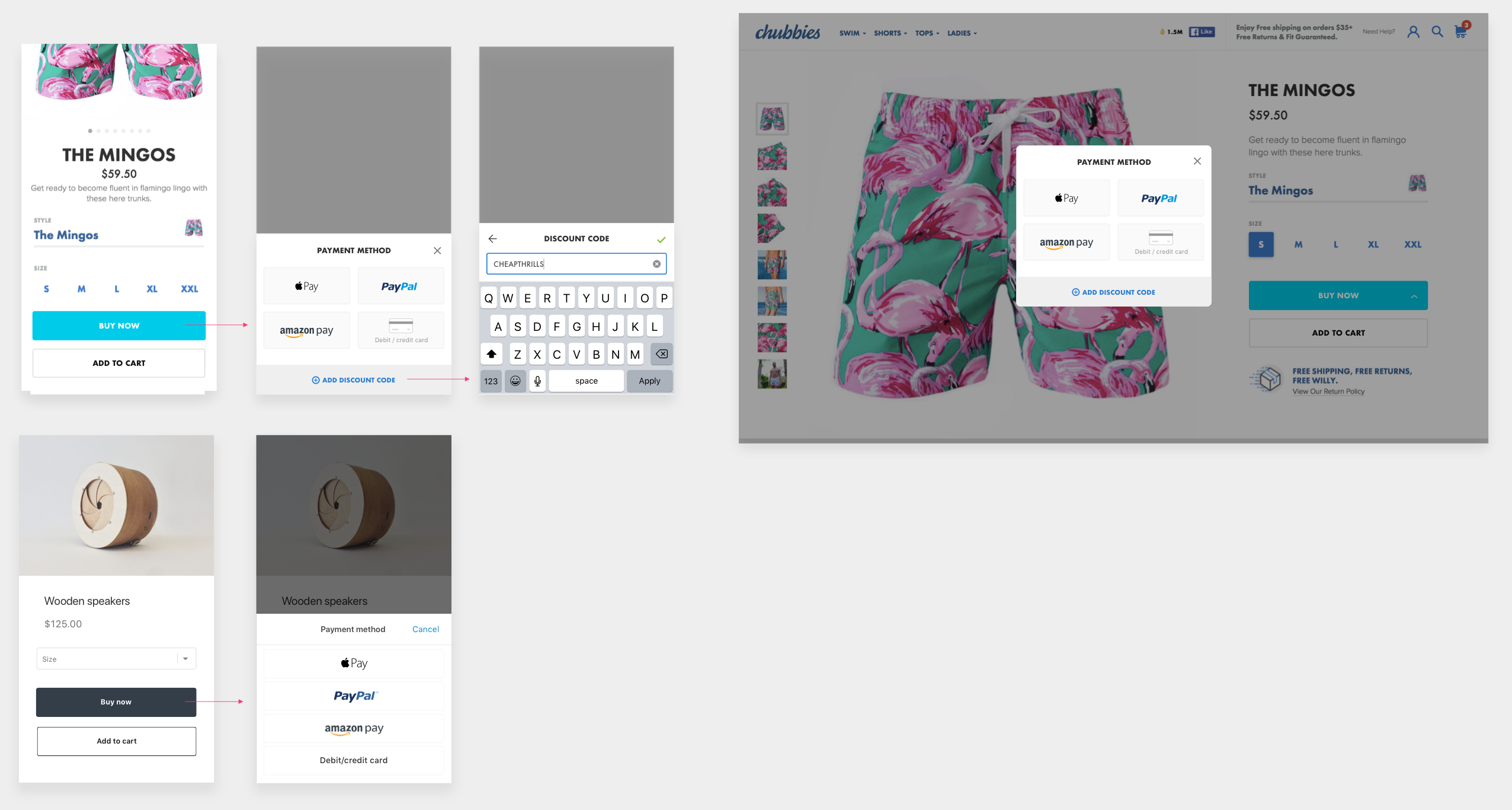
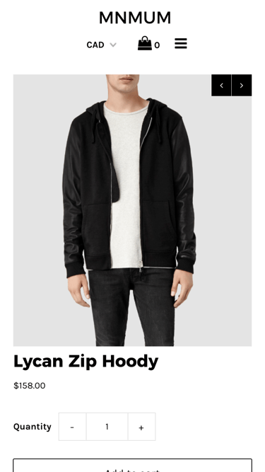
So we wanted to let buyers quickly checkout an item from the product page. You'd think the solution was as simple as adding a "Buy now" button, but turns out it was much more complicated due to the involvement of wallets. Apart from regular checkout forms, Shopify supports a number of digital wallets — such as PayPal and Apple Pay — that let buyers accelerate checkout with their saved information, and every online store had a different combination of these. We had to make sure buyers had access to their preferred wallet without overwhelming them with options, and without adding complexity to the product page.

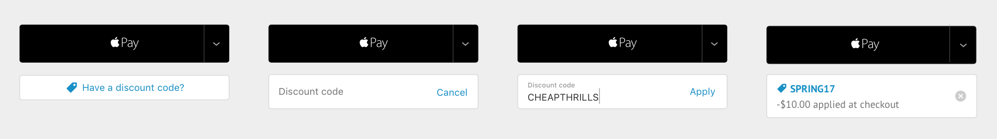
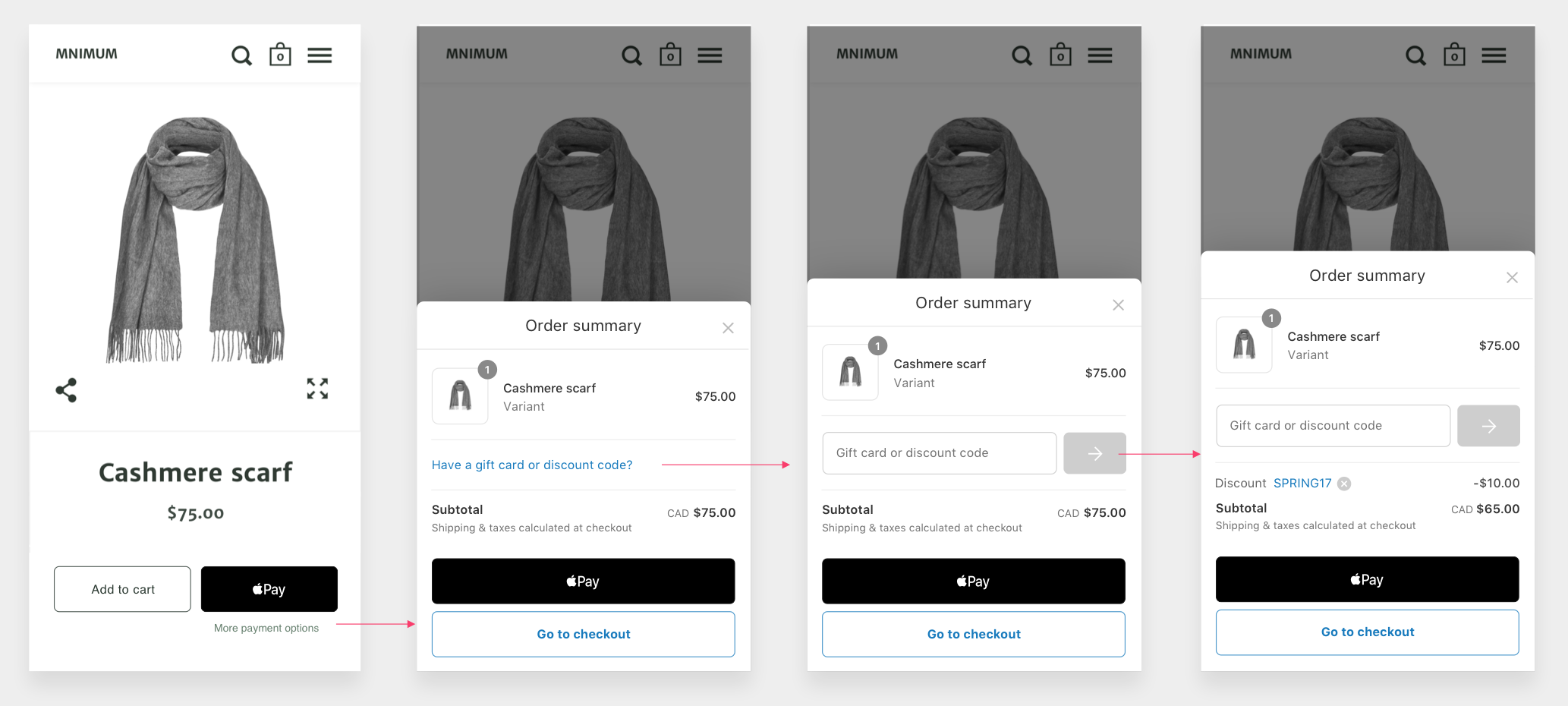
Another challenge was in supporting discounts. Discounts are vital driver of sales and essential for some customers, but most wallets don't have a discount step. Our mandate was to ensure that buyers are still able to apply a discount before continuing to an express checkout.
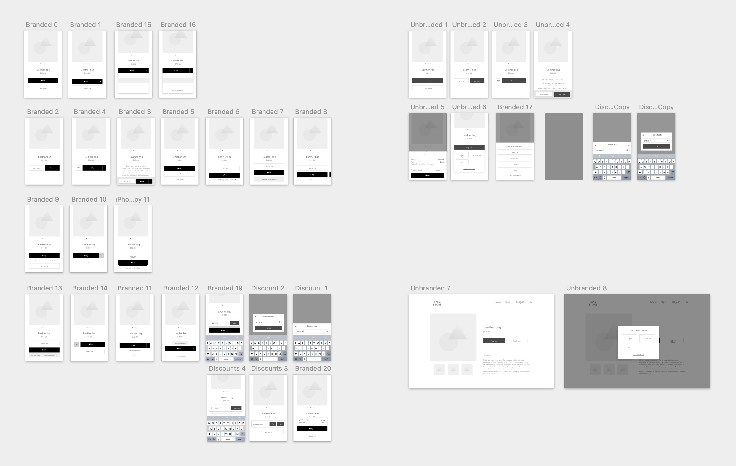
Merchants can enable up to 6 digital wallets (and more to come), which are typically the colorful buttons you see at checkout. In bringing these options to the product page, I wanted to reduce the button noise and make the call to action simple and clear. We explored two different directions - one with branding (ex. "Buy with Apple Pay") and one without ("Buy now").
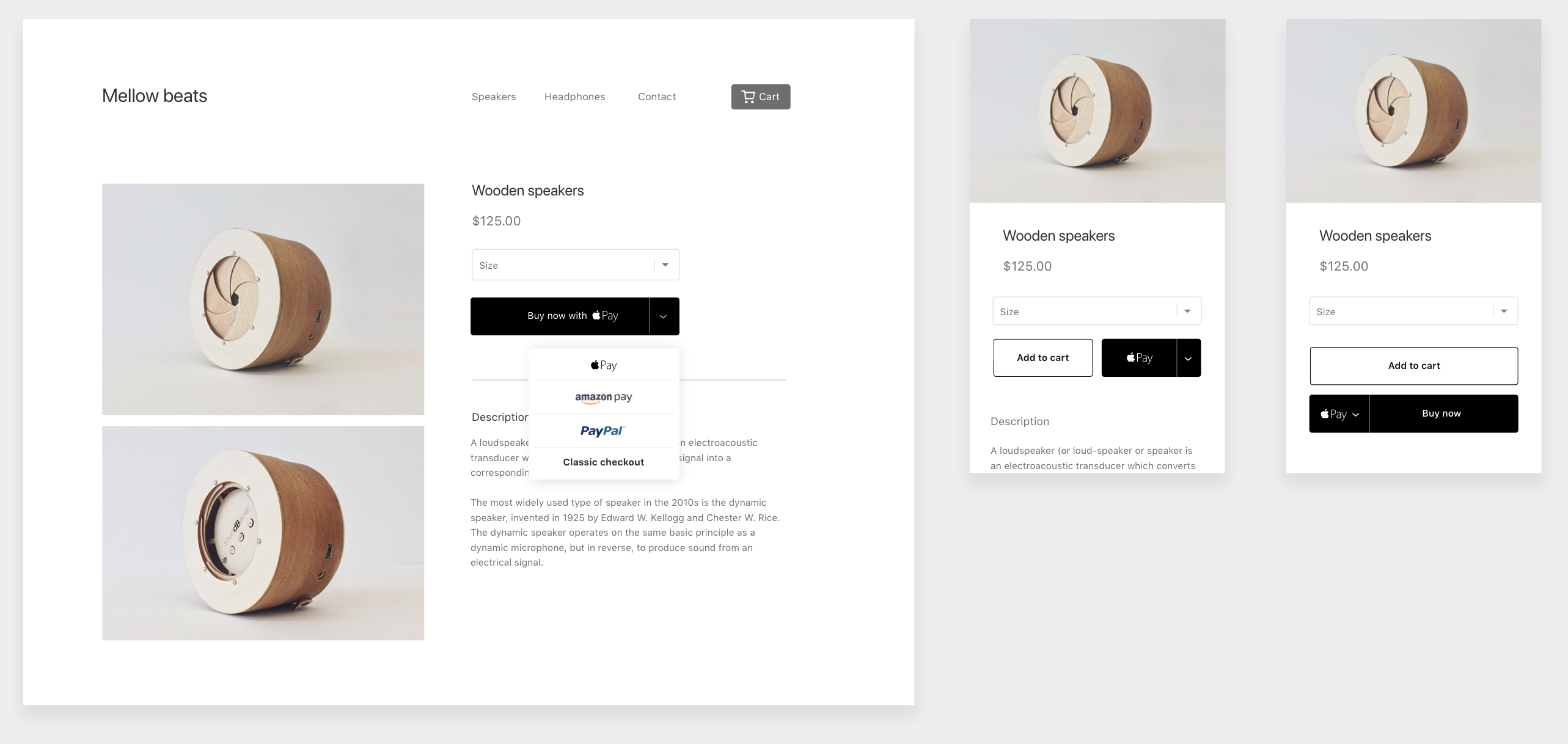
The unbranded direction is straight forward and keeps the product page clean, but adds an additional click while hiding branding benefits. The branded direction adds a bit of noise and is harder to integrate into the product page, but there's opportunity here to personalize what we show to the buyer.
Around this time we conducted user research on the effects of brand recogition, which confirmed that showing a familiar brand can make buyers more comfortable and trusting with checking out directly from the product page. This gave us the confidence to pursue a branded direction.
Discounts were tricky to integrate outside the cart/checkout, and there's always a fine line between advertising them too much (which encourages buyers to go on a hunt), and keeping it too hidden (which is frustrating for customers who are looking for them). Here I played around with a couple of different designs.
During some user testing, we found that participants were finding branded dropdowns and segmented dropdowns to be slightly confusing. It wasn't clear what was the main call to action, and it was hard to tap on smaller screens. So we tried steering away from complex buttons and explored a dynamic design where we could show a single checkout button that changes depending on what each customer is most likely to use. This is what we call the "preferred" wallet. Working closely with our backend devs and data scientists, we came up with an algorithm to detect this preference based on a variety of factors, such as wallet data, checkout history and device and browser compatability.
For example, buyer A is an Apple Pay user and is on a device and browser that supports the wallet. The merchant supports Apple Pay, and so we'll show an Apple Pay button. Buyer B doesn't have a relationship with any wallet. Thus we'll show the standard "Buy now" button that goes to regular checkout. This removes the complexity from the product page, and also prevents us from showing options that buyers won't be likely to use.

That being said, nailing the dynamic behaviour was more complicated than it sounds. We had to make sure that the decision-making in the background does not compromise page load or the browsing experience, and that a check for the preferred wallet is consistent across the browsing experience for each buyer.
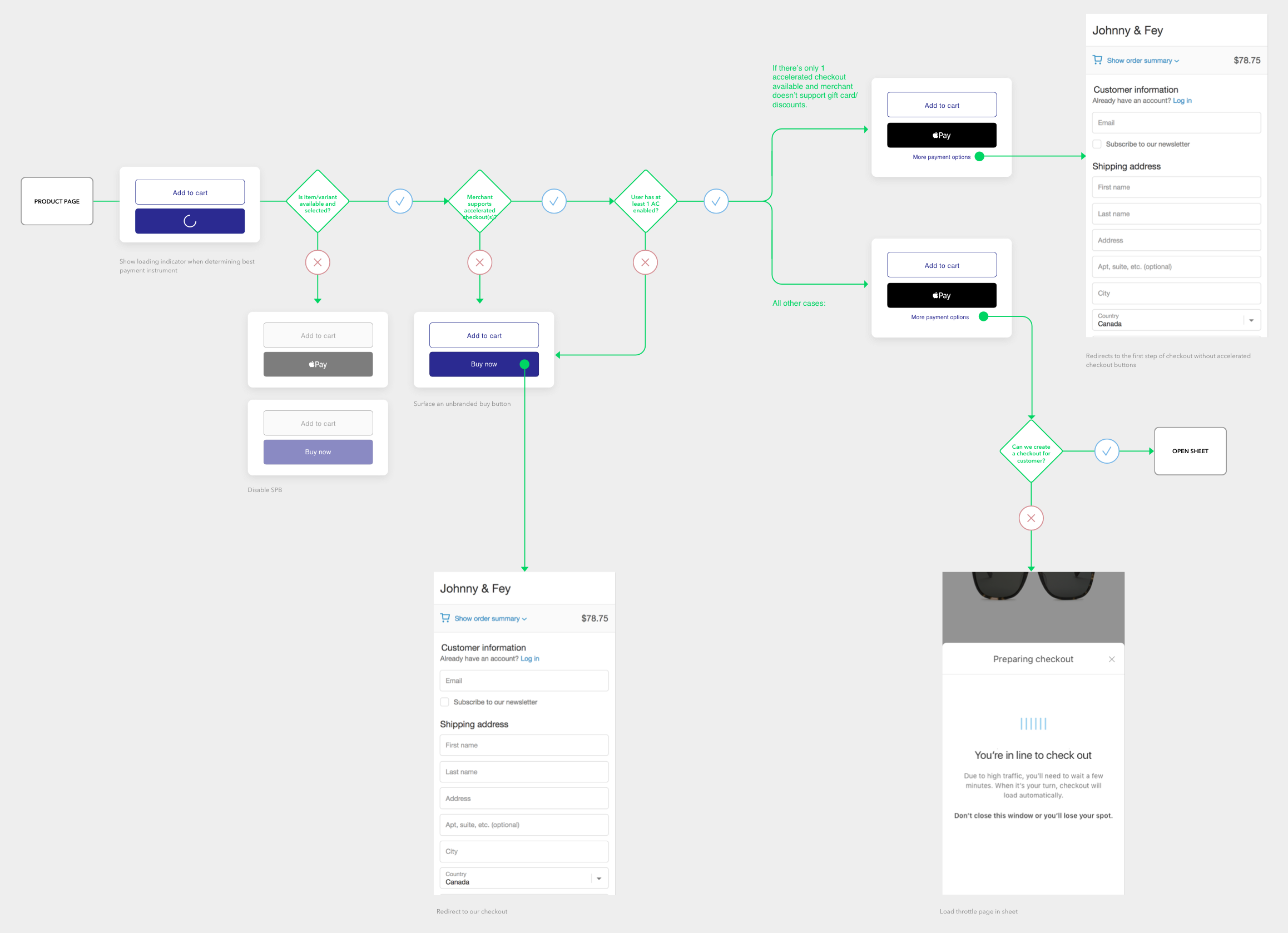
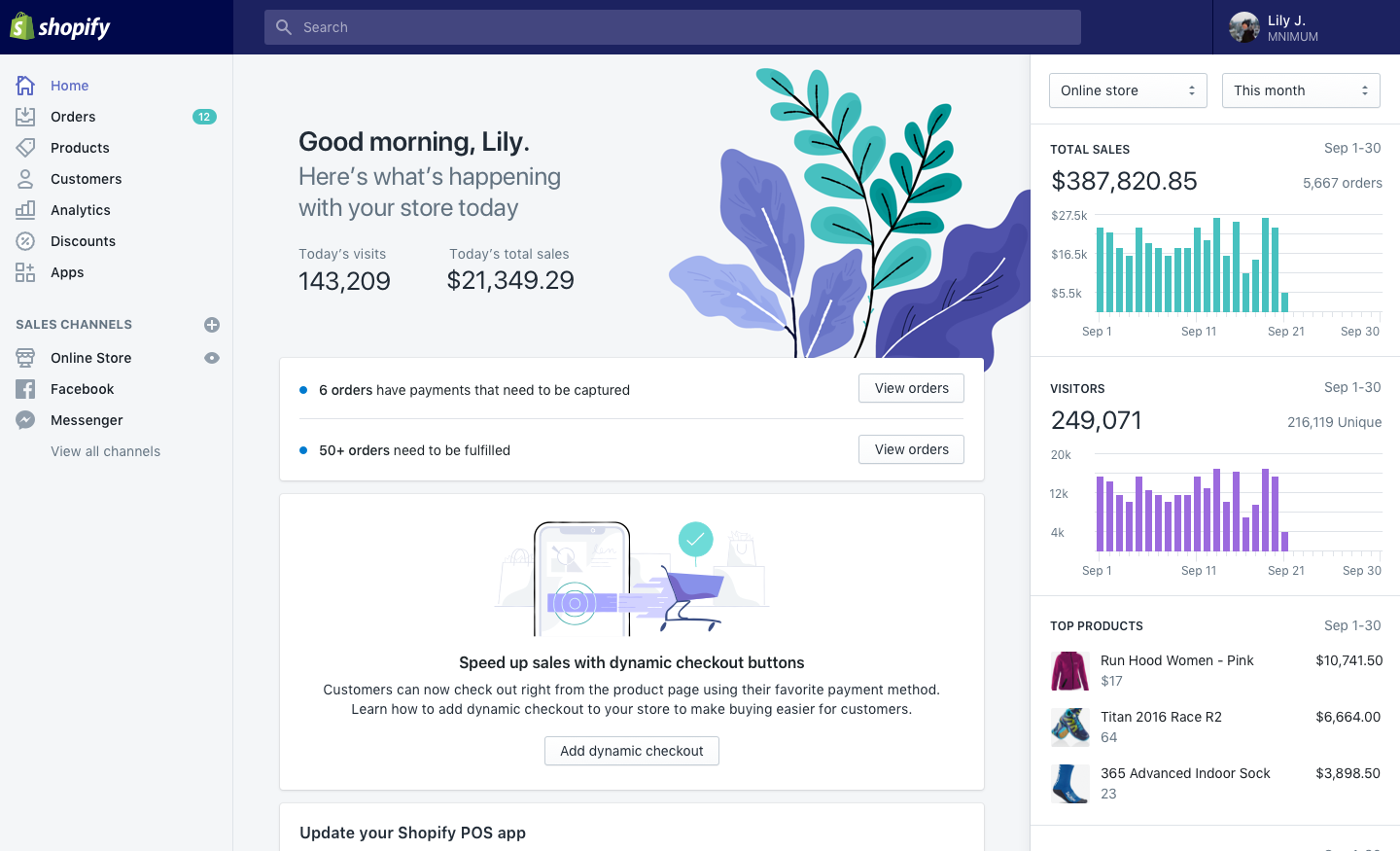
On the other side of the coin, we had to design the merchant experience which includes feature discovery, theme settings and customization. We decided to use a home card to announce the new feature to existing merchants, whereas new merchants would have the feature enabled by default. Because we were introducing a new behaviour, it was tricky to illustrate the dynamic nature of the button without overcomplicating the feature. Some of our setting explorations include having a dynamic preview in the theme editor, as well as a reminder of the express methods that have been enabled on the store. In the end we opted for a simple checkbox with a quick description to a Learn more for this rollout.

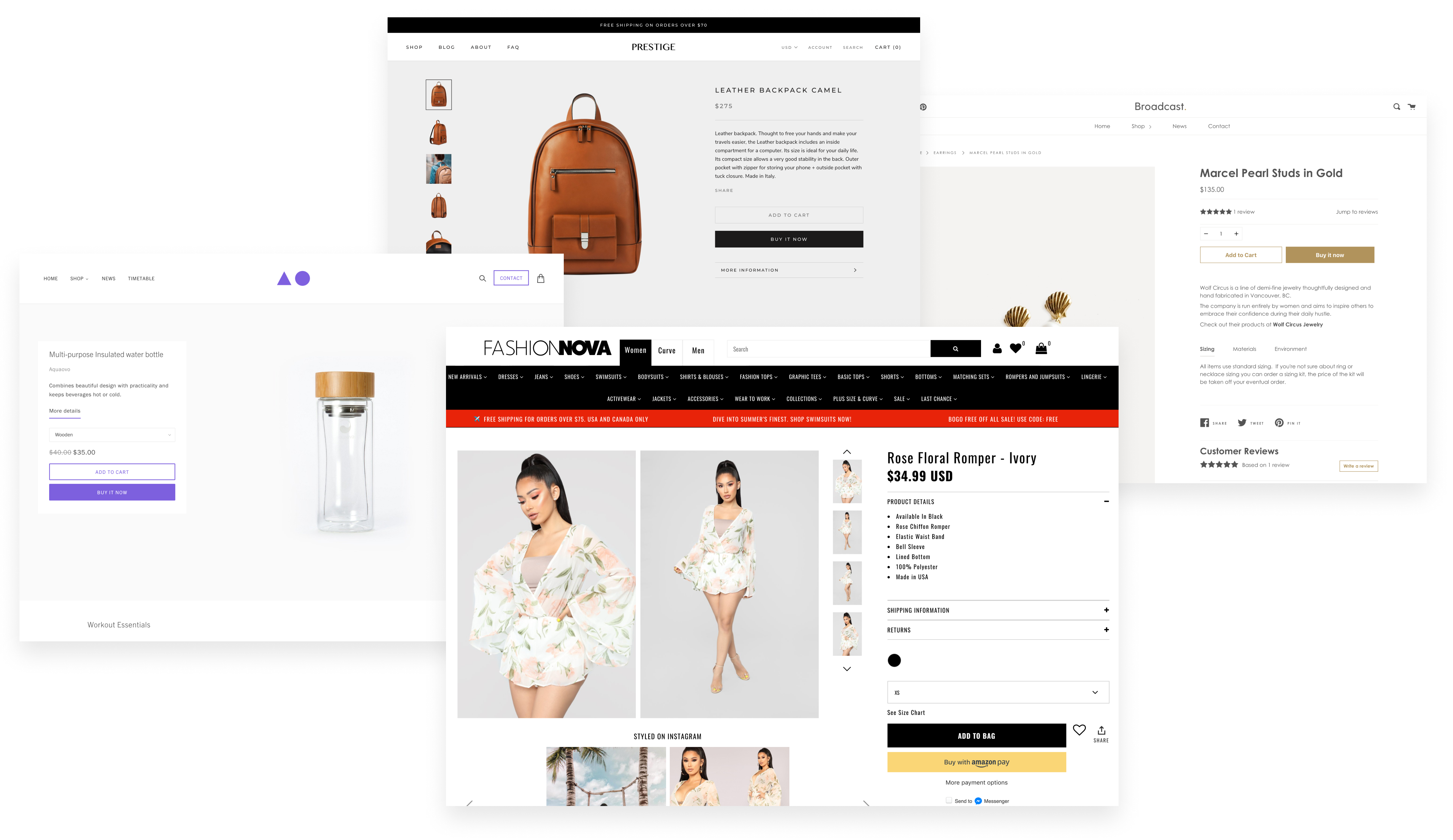
This phase of the project was actually the most complicated. Unlike marketplaces like Etsy or Amazon, Shopify stores are customized on top of 70+ themes, most of which are created by developers outside of Shopify. Every theme has its own color palette, type, layout and customizable components, which meant that any new feature - even a simple button - had to be meticulously fitted across all themes. To do this I worked closely with the Themes team to integrate it on Shopify's free themes, and we created a UI guidelines for third party developers. Although this took much longer than we expected, finally seeing the feature across these beautiful themes was a satisfying experience!
Despite having no marketing push other than a simple home card, we saw a huge number of merchants adopting the feature. Since our initial rollout we've had 60k+ turn on dynamic checkout, including the ever popular Fashion Nova (see below). 🎉
This is by no means the end of the dynamic checkout project. We received a lot of valuable feedback from merchants and users, and we're excited to improve the feature. Some things in the pipeline include adding more clarity and control in merchant settings around the dynamic behaviour, revisiting the discount flow, removing button noise, and enabling better localization. This will also be the start of an entire checkout personalization, as we bring the intelligence to the our checkout forms.