Building Stories is a user-generated database of historic Canadian architecture and sites. Due to its early conception, the web and mobile platforms have become extremely outdated. My team at UWaterloo was tasked with creating a new interface and brand identity to help Building Stories create a stronger user base. Throughout the project, I was responsible for leading the web redesign and rebranding.
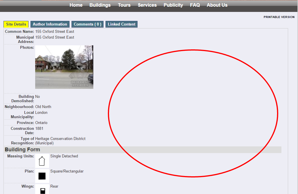
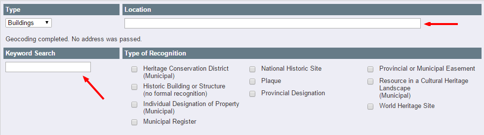
Below are screenshots of the existing website. In order to pinpoint what design elements were discouraging users from interacting with the platform, we dedicated the first 3 weeks to talking to stakeholders and conducting user discoveries. We connected with Building Stories founders - the Heritage Resource Centre - as well as Building Stories users to understand pain points from both sides.
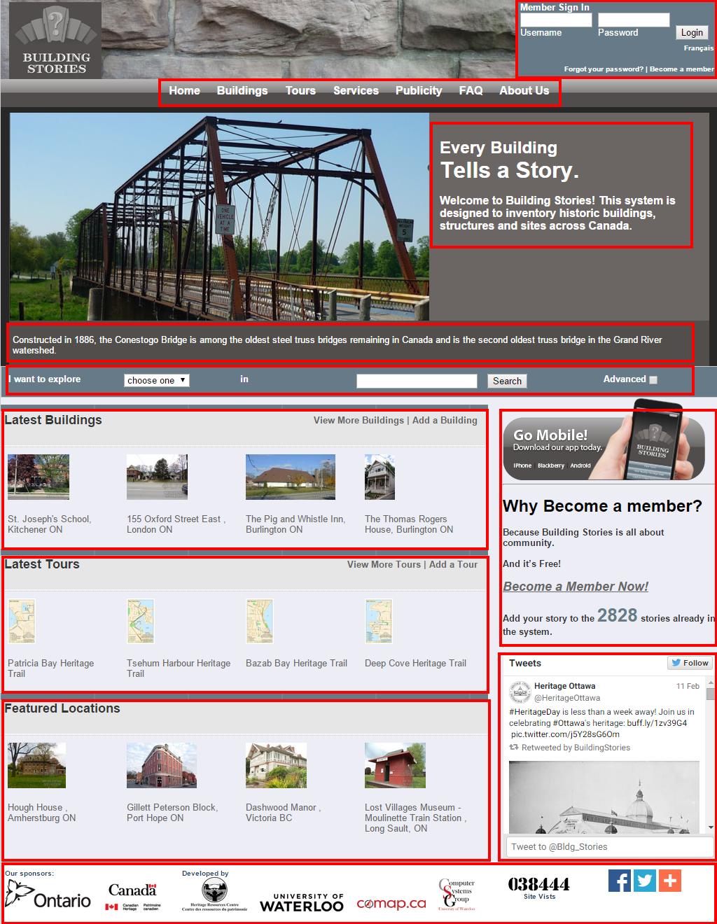
We found out that users were generally struggling with the following tasks:
1. Navigating the highly complex structure to search for information
2. Distinguishing one level of information from another
3. Finding buttons and links to complete their task
We then asked our client what information and tasks they were struggling to relay to users. Their main concerns include:
1. Communicating the right brand feel
2. Attracting younger demographics to the platform
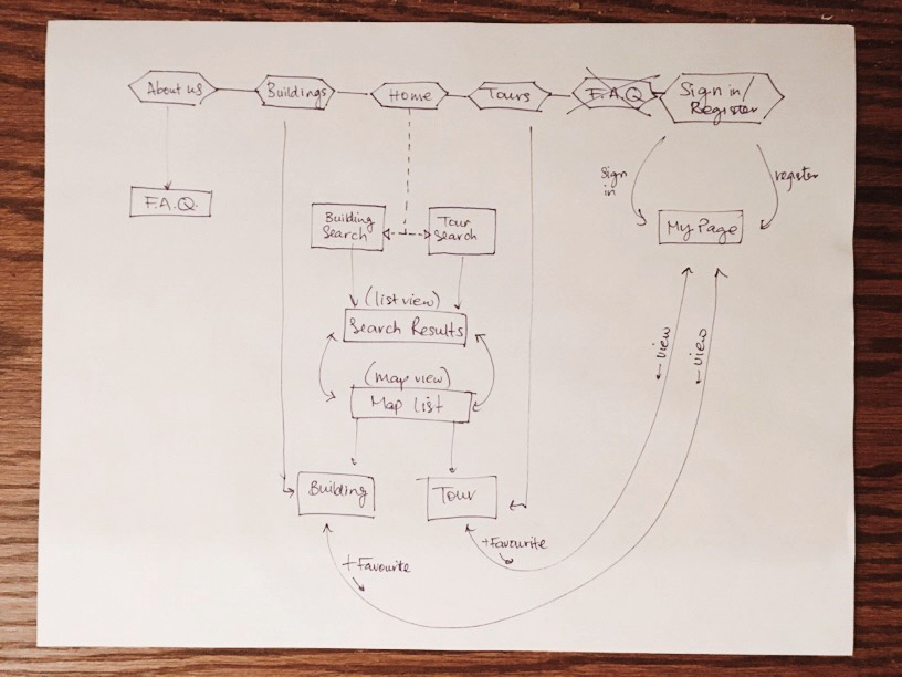
I worked with Ruby (our information architect) to recreate a website structure which eliminates the pain points and allowed for simple navigation.
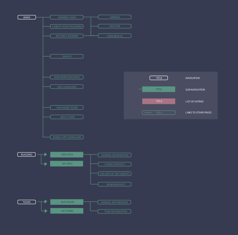
The sitemap comparison below shows how we simplified and condensed the navigation to have fewer entry points. Fewer options for the user makes content much more digestible and less taxing. Additionally, we connected relevant pages to each other for more intuitive entry points.
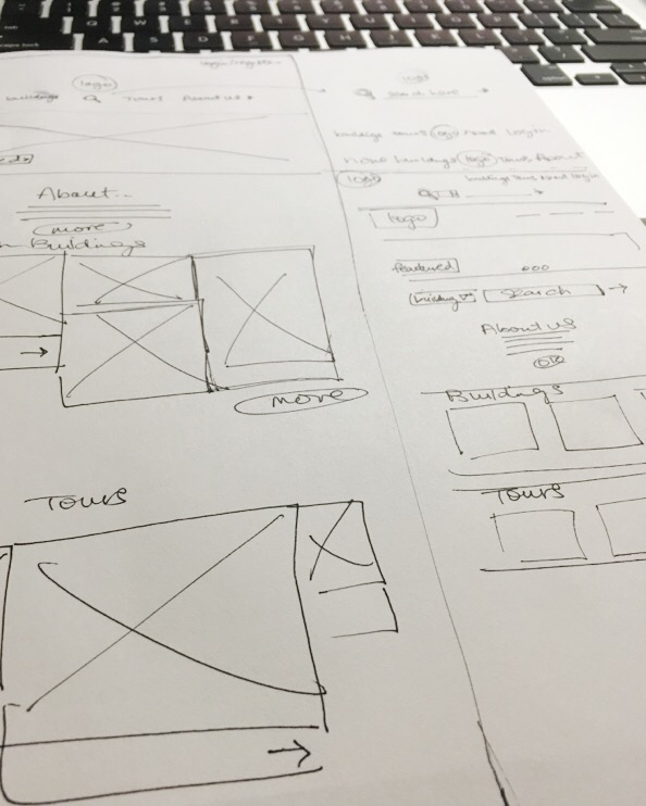
Using our new sitemap, we sketched out wireframes for each page and Mary (our UX Designer) developed the hi-fidelity designs.
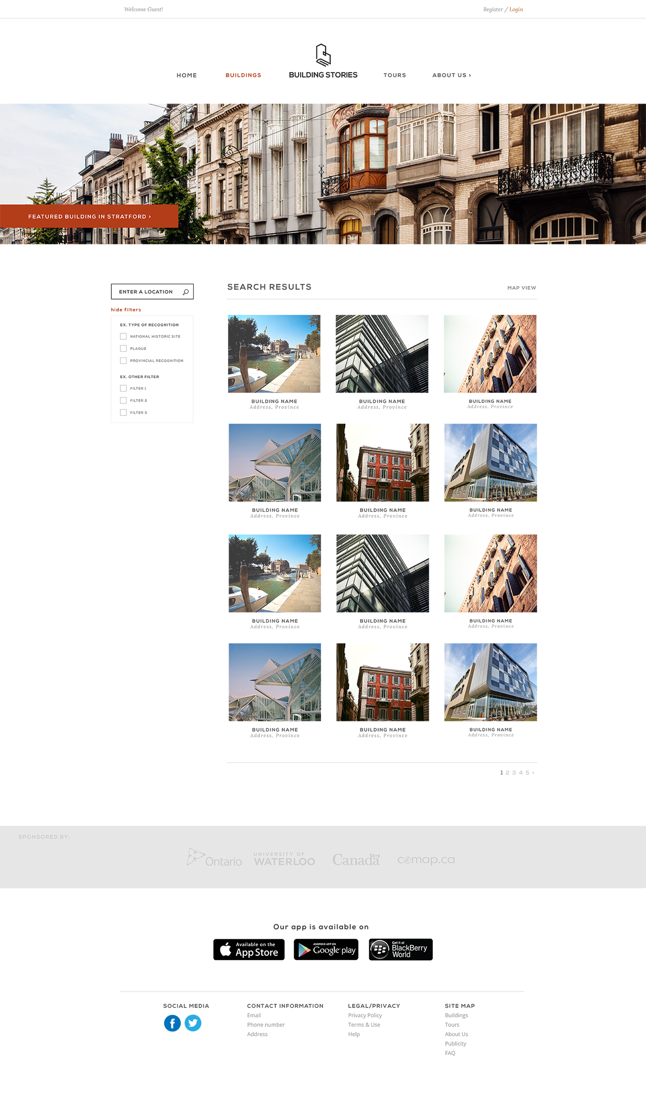
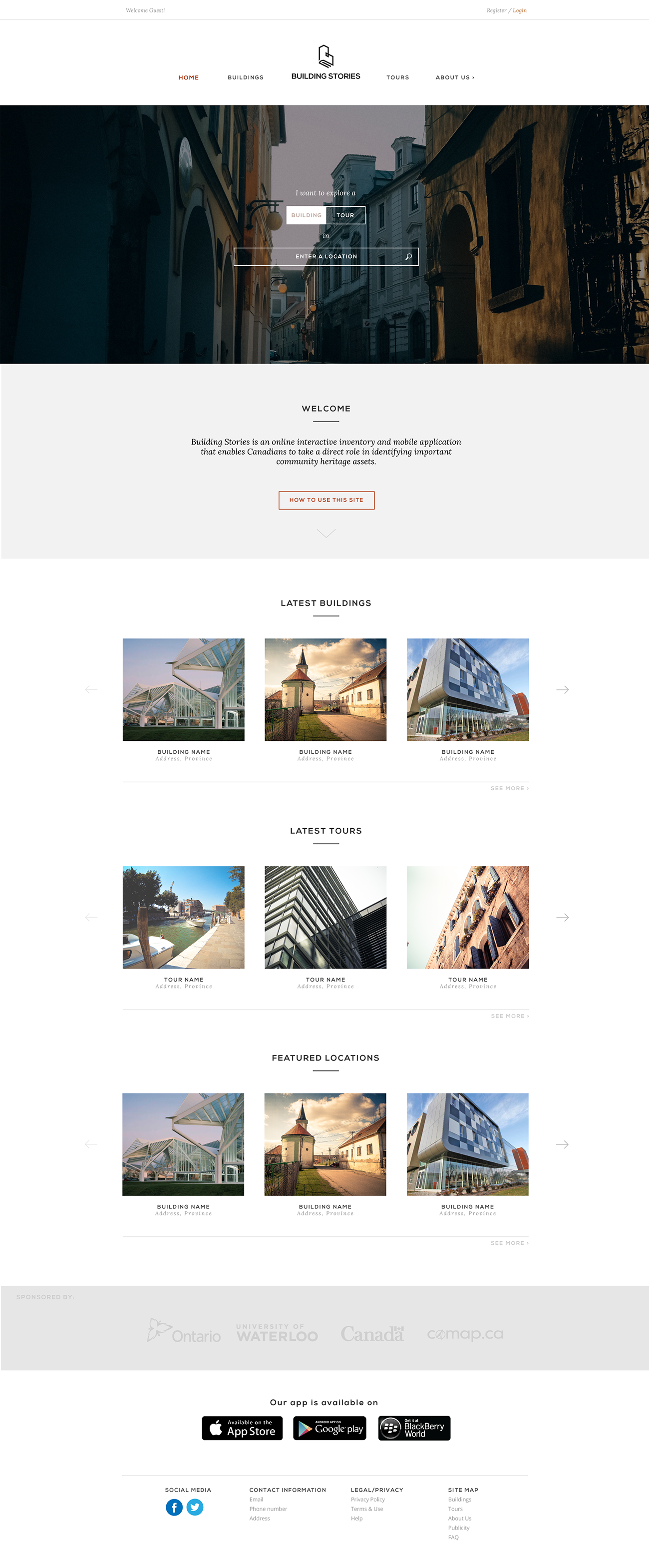
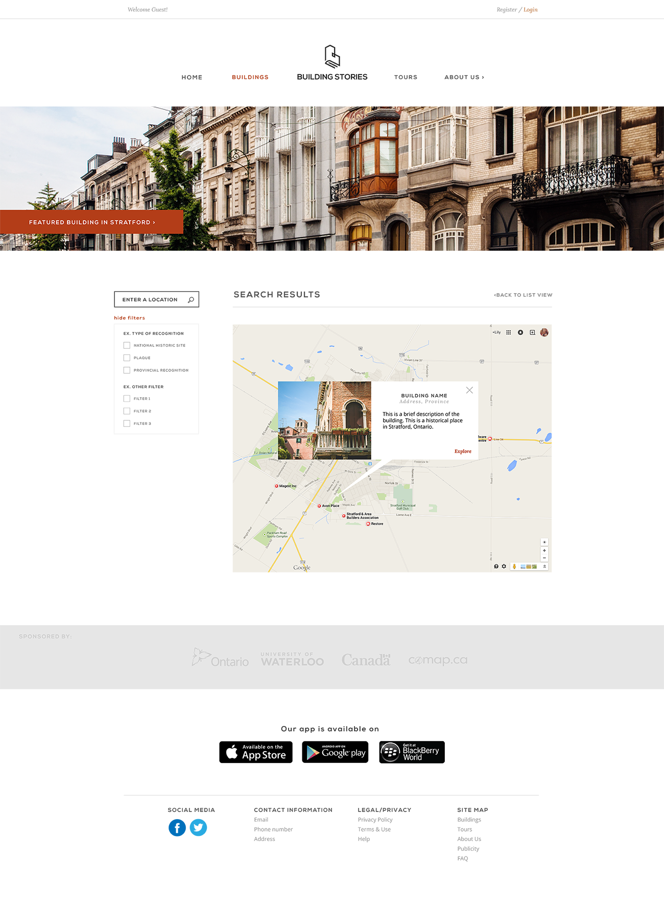
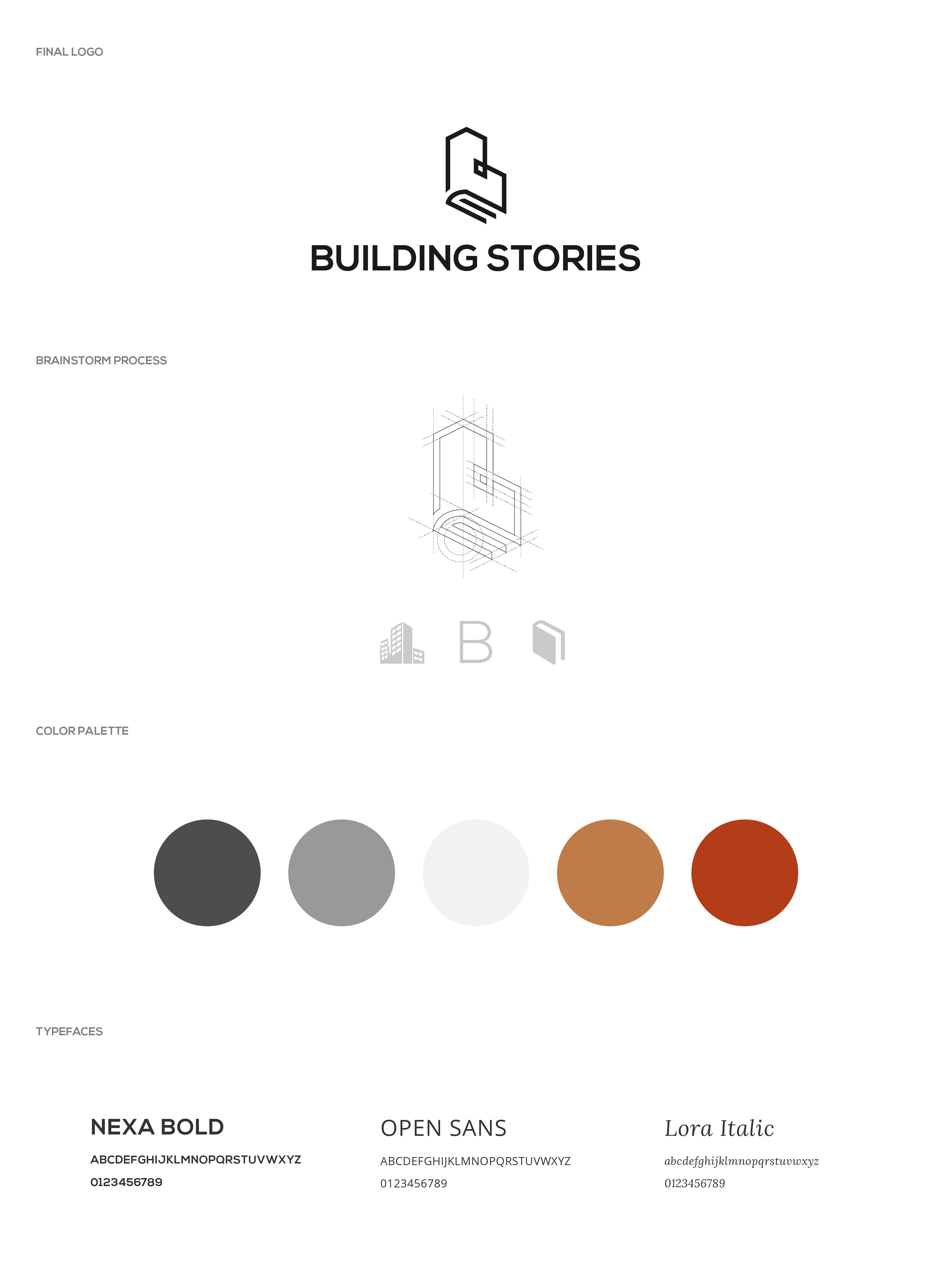
Building Stories needed a new branding scheme - something that is more modern, memorable, and representative of what the platform offers. I took on the role of designing the new logo as well as carefully selecting a new color palette and typefaces. The new logo embodies the image of both a building and a book, while the color palette reflects the earthy tones of building materials.
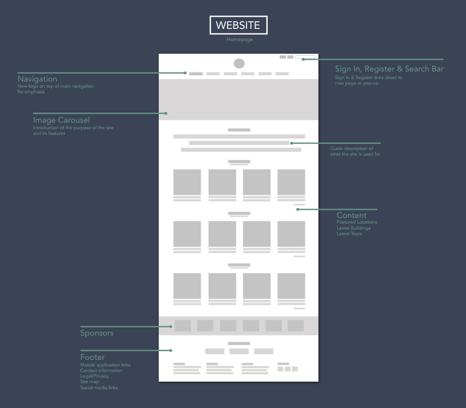
All designs and mockups were created on Adobe Illustrator.
Here are the final mockups which I've created on Adobe Illustrator, featuring an identifiable brand and tone, modern interface and intuitive navigation.